| T O P I C R E V I E W |
| quahys |
Posted - 25 Jun 2013 : 03:36:41
Hi.
Let's say I have set 50 datapoints to be shown within a chart view. However, I only have 30 datapoints for the chart. Is there a way to extend the control limits until the end of x-axis? |
| 15 L A T E S T R E P L I E S (Newest First) |
| TonyCoolearth |
Posted - 17 Jan 2014 : 18:20:44
One little wrinkle FYI: This "solution" only works with the source we just bought. Doing it with the old binaries doesn't affect the behavior. |
| TonyCoolearth |
Posted - 17 Jan 2014 : 17:32:03
Stepping through the source I discovered.
SPCChartBase::InitializeChartSimpleDataset
in our production app
when j = 3 (SPC_LOWER_CONTROL_LIMIT_2)
controllimititem.plotSimpleDataset.YData = {102.0, 102.0, 102.0, 102.0, 0.0, 0.0, 0.0, 0.0 }
when j = 4 (SPC_UPPER_CONTROL_LIMIT_2)
controllimititem.plotSimpleDataset.YData = {129.0, 129.0, 129.0, 129.0, 0.0, 0.0, 0.0, 0.0 }
when j = 5 (SPC_LOWER_CONTROL_LIMIT_1)
controllimititem.plotSimpleDataset.YData = {115.0, 115.0, 115.0, 115.0, 0.0, 0.0, 0.0, 0.0 }
in modified example app
when j = 3 (SPC_LOWER_CONTROL_LIMIT_2)
controllimititem.plotSimpleDataset.YData = {0.0, 0.0, 0.0, 0.0, 0.0, 0.0, 0.0, 0.0 }
when j = 4 (SPC_UPPER_CONTROL_LIMIT_2)
controllimititem.plotSimpleDataset.YData = {0.0, 0.0, 0.0, 0.0, 0.0, 0.0, 0.0, 0.0 }
when j = 4 (SPC_LOWER_CONTROL_LIMIT_1)
controllimititem.plotSimpleDataset.YData = {0.0, 0.0, 0.0, 0.0, 0.0, 0.0, 0.0, 0.0 }
So, adding this line to our production application
TheDataChart.ChartData.SetControlLimitValues(new[]
{
0.0,0.0,0.0,0.0,0.0,0.0
});
causes the spec lines to appear as expected.
Problem fixed! Thanks! |
| quinncurtis |
Posted - 17 Jan 2014 : 17:01:00
The source you purchased is three years later than your original software. You must use both the new QCChart2DWPF3.DLL (Rev. 2.3) and the new QCSPCChartWPF3.DLL (Rev. 2.3) together in any project. |
| TonyCoolearth |
Posted - 17 Jan 2014 : 16:32:32
The software has been working fine. Our customer asked us to change the control limits to spec limits so instead of varying as you go, they are fixed and independent of the data. (And indeed, they are really "spec" limits. They come out of our spec table.)
In practice they never encountered the control limit labels showing up at weird places (or didn't notice) because their process produces valid data and presumably the chart scales correctly in that instances, however, the idea is to have horizontal lines that never vary and the control limits appear to vary over time.
The person who integrated your controls left the company so I'm trying to figure out what he did. Starting over and working backward is not something I'm willing to do at this point. I'm more likely to just plot horizontal lines on top of the control.
We've got your source now. I may ask you for help with it as I step through it. I will certainly inform you of anything I find. |
| quinncurtis |
Posted - 17 Jan 2014 : 16:11:50
Your company has had this software for almost three years. Is this the first time it has been used? Or did you have an application which worked, and now it doesn't anymore? It seems strange that after three years you can't get the most basic control limit function to work in your program, while all of our examples work fine.
If you want to purchase the source code in order to try and debug it, that's up to you. Our source is pretty complicated though. If I were you I would just scrap every line of code you have which uses our classes, by removing the references to our DLLs from the project. Then then start from scratch by adding in a known module which you know works (i.e. our example programs). Then step by step evolve that back into what you need in your actual application. At some point it may stop working again, in which case you will have some idea as to what caused it.
If you are unable to reproduce the problem in any program outside of your large application program, we are willing to look at that if you are willing to send us the complete project. |
| TonyCoolearth |
Posted - 17 Jan 2014 : 15:48:05
I can plot control lines just fine. The problem is that the correspondent labels end up getting plotted at apparently random locations. That's why I'm working with spec lines now. The labels for those plot all the way to the right of the graph as expected. The problem is that the actual spec *lines* plot at y = 0.0 no matter where they're set unless I copy my code to the sample application (where I'm using exactly the same data with its zero variance, etc.) Then both the spec lines and the correspondent labels plot as expected.
Since I'm working with spec limits instead of control limits, I varied what I did from your instructions:
1. I add the spec limits.
2. I simulate the data. The version of this function to which you directed me does not take any parameters, but I assumed the 30 is meant to be the upper bound on the for loop, so I adjusted it. I also needed to pass in the chart control:
private void SimulateData(SPCBatchVariableControlChart spcChart)
{
// batch number for a given sample subgroup
int batchCounter = 0;
for (int i = 0; i < 30; i++)
{
// Important to make a new ChartCalendar object each time
ChartCalendar timestamp = (ChartCalendar)startTime.Clone();
// randomize the timestamp a bit
int randomminute = (int)((timeincrementminutes - 1) * ChartSupport.GetRandomDouble());
timestamp.Add(ChartObj.MINUTE, randomminute);
// Simulate a sample subgroup record
DoubleArray samples = spcChart.ChartData.SimulateMeasurementRecord(100, 130);
// Update chart data using i as the batch number
batchCounter = i;
// Add a new sample record to the chart data
spcChart.ChartData.AddNewSampleRecord(batchCounter, timestamp, samples);
// Simulate passage of timeincrementminutes minutes
startTime.Add(ChartObj.MINUTE, timeincrementminutes);
}
}
3. I plotted the chart.
Now I neither have data on the chart (probably because the y-axis is scaled from 0 to 10.0 in spite of the fact that I called AutoScalePrimaryChartYRange after adding the data) nor spec line labels. Spec lines are still at y = 0.0.
I confess I didn't take the time to comprehend your simulate function.
I think my next step is to get your source and step into it so I can see what's going on. |
| quinncurtis |
Posted - 17 Jan 2014 : 08:16:54
Try and lock out your own data update routine. Instead, use one of our SimulateData methods (pull it from BatchVariableControlCharts.BatchXBarRChart) routines and simulate the data immediately after you set the control limits.
double[] controllimitvalues = { 30, 24, 36, 10, 0, 22 };
spcChart.ChartData.SetControlLimitValues(controllimitvalues);
SimulateData(30);
What are the results?
Also, are you using concurrent threads with our software in any way? |
| TonyCoolearth |
Posted - 16 Jan 2014 : 21:10:25
And yes, I can make the modified example app exhibit the errant behavior exactly by entering data before I set the limits, however that's not what I'm doing in the production app. |
| TonyCoolearth |
Posted - 16 Jan 2014 : 20:47:43
The difference between the modified example app and our production app is that ours places the labels for the specs at the correct location, but draws the lines for them at y = 0.0. The modified example application puts both the lines and the labels for the specs at the correct location. However both applications are apparently doing exactly the same thing in exactly the same order.
When I examine PrimaryChart.ControlLimitData in the debugger in either application, the results look identical.
Obviously there's something I'm overlooking... |
| TonyCoolearth |
Posted - 16 Jan 2014 : 20:30:13
Thank you for this.
I saw your earlier reply. I've spent the last hour installing and configuring SPCApplication1 (WPF) such that it is almost identical to what we have in our million line production application.
Naturally, the spec lines show up when run from the modified sample code. It too bad there's no way for me to serialize the internal state of the object so I can compare the bad one to the good one. I may have to spring for your source code just so I can step into the RebuildCharUsingCurrentData() routine and see what it's doing. |
| quinncurtis |
Posted - 16 Jan 2014 : 19:17:42
Sorry, but we do not know what the problem is. It still look like you are entering data before you set the limits, but you say that is not the case.
You will probably have to try and create for us an example which fails. All you have is some data, and some limits. You should be able to take one of our example programs (BatchVariableControlCharts.BatchXBarRChart, or SPCApplication1) and modify it to reproduce your problem. It should take more that 10 minutes. It will take us no longer than 5 minutes to identify the problem once we have the example.
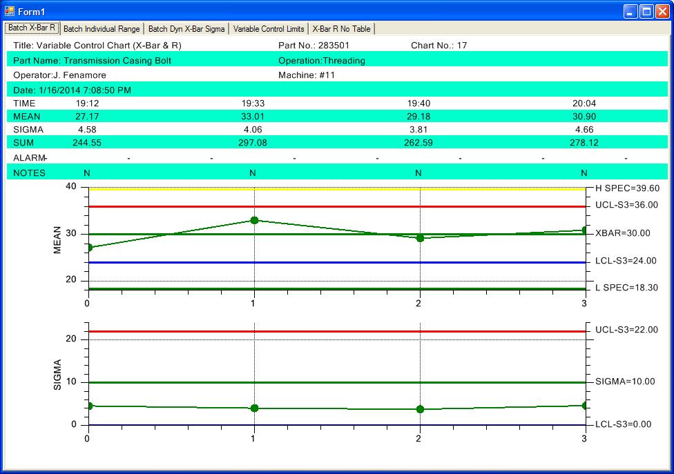
We recreated a similar example. It took us all of 60 seconds. The picture is below. The relevant code is shown below:
this.PrimaryChart.AddSpecLimit(SPCChartObjects.SPC_LOWER_SPEC_LIMIT, 18.3, "L SPEC", new ChartAttribute(Color.Green, 3.0));
this.PrimaryChart.AddSpecLimit(SPCChartObjects.SPC_UPPER_SPEC_LIMIT, 39.6, "H SPEC", new ChartAttribute(Color.Yellow, 3.0));
double[] controllimitvalues = { 30, 24, 36, 10, 0, 22 };
this.ChartData.SetControlLimitValues(controllimitvalues);
// Must have data loaded before any of the Auto.. methods are called
SimulateData();
// Calculate the SPC control limits for both graphs of the current SPC chart (X-Bar R)
// this.AutoCalculateControlLimits();
// Scale the y-axis of the X-Bar chart to display all data and control limits
this.AutoScalePrimaryChartYRange();
// Scale the y-axis of the Range chart to display all data and control limits
this.AutoScaleSecondaryChartYRange();
// Rebuild the chart using the current data and settings
this.RebuildChartUsingCurrentData();
If you want we can send you the complete source file. It just replaces one from the BatchVariableControlCharts example program.
|
| TonyCoolearth |
Posted - 16 Jan 2014 : 18:25:42
FYI, here's what the chart looks like with the spec limits on it. (I've eliminated the extreme outlier point.)
 |
| TonyCoolearth |
Posted - 16 Jan 2014 : 18:19:53
Thank you for the offer. Unfortunately, it would take me the better part of a day to extract a test case from this spaghetti and I'm on a tight time schedule. (I know. Strange for the software biz.) ;-)
I did manage to work around the issue by adding spec limits and setting the control limit labels all to empty string. The spec limits are appearing on the right at the expected y-values (yea!) but alas, they are not associated with horizontal lines, even though I set the correct chart attribute:
TheDataChart.PrimaryChart.AddSpecLimit(SPCChartObjects.SPC_LOWER_SPEC_LIMIT, val1, "L SPEC", new ChartAttribute(Colors.DarkRed, 3.0));
TheDataChart.PrimaryChart.AddSpecLimit(SPCChartObjects.SPC_UPPER_SPEC_LIMIT, val2, "H SPEC", new ChartAttribute(Colors.DarkRed, 3.0));
TheDataChart.PrimaryChart.AddSpecLimit(SPCChartObjects.SPC_CONTROL_TARGET, val3, "TARGET", new ChartAttribute(Colors.DarkRed, 3.0));
Part of the problem was that I was creating the limits after the data was on the chart, so that piece of feedback was very helpful. I'm no longer doing that however, and I still don't have horizontal lines.
Thoughts?
Thanks
Tony |
| quinncurtis |
Posted - 16 Jan 2014 : 16:09:52
Sorry, but we do not know how to reproduce your problem. I don't think it has anything to do with the control limits only being drawn to the last value data point. See if you can reproduce it by making some sort of simple change to one of our example program, and then describe/show the changes. If that is not possible, you will need to send us an example program (the simplest possible) which uses valid data, which reproduces the problem. Zip up the complete product and send it to support@quinn-curtis.com.
One thing, if you are are going to set the control limits manually, you must call SetControlLimitValues BEFORE you start adding any data to the chart.
|
| TonyCoolearth |
Posted - 16 Jan 2014 : 15:34:17
Hi there, and thanks for replying so quickly!
Indeed the data is contrived and sigma is zero because our people just entered the same value over and over for testing. However, I explicitly set the control limits with a call to SetControlLimitValues. My expectation was that this would draw horizontal lines at the supplied locations on the y-axis and label those them with the supplied values. It's unclear to me why the label for XBAR would be on the right as expected, while the labels for UCL and LCL would be located in apparently random locations. (It would be different if UCL and LCL were being computed.)
Even if I adjust my range such that the data is all within an order of magnitude, the location of the UCL and LCL remains somewhat random. |
|
|
