Case Study #7 – Patient Monitoring and Analysis Software
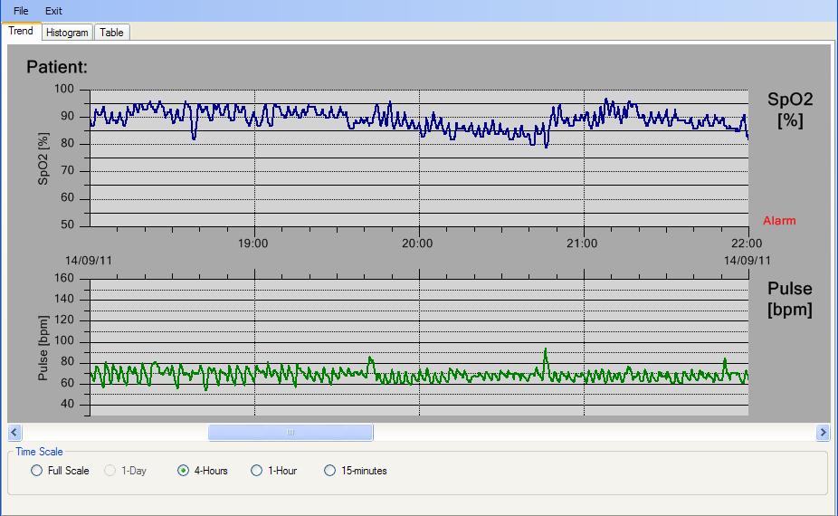
A German supplier of patient monitoring hardware/software had us create a prototype recreating and enhancing one of their existing software packages. Based on our QCChart2D for .Net software, it combines reading a custom ASCII source data file, displaying the data as trend lines in a scrollable, zoom-able chart, creating frequency histograms of the data, and displaying the data in a scrollable data table.
Source data file – The source data file is a simple ASCII text data file containing the following information:
- Header information
- Each data line includes an alarm flag, SPo2 level as % of full scale, pluse rate in BPM and a time stamp
- The size of the file can exceed seven days of five-second data, for a test upper limit of 120K rows of data.
Display Features
There will be three display screens, organized using a simple tabbed control from the main application window. The three display screens are trend (line) plots of the measured data, frequency histograms of the measured data, and a text table of the measured data.
Trend (line) Plots
Line plots of the measured variables (SpO2 and Pulse), displayed in two separate windows, one above the other, using a common x-axis (time axis).

- The scale y-axis scale of the SpO2 graphs is fixed at 50-100%
- The y-scale of the Pulse graph auto-scales between a low of 30 and high of 100, 160 or 250 bpm, based on the maximum pulse value of the entire data file.
- An vertical marker will be place along the x-axis whenever an input row is in alarm.
- The range of the x-axis will be controllable using simple radio buttons, specifying ranges of Full scale to 15-minutes.
- The x-axis can be panned (scrolled) left or right using he built-in scroll bar. The size of the slider of the scroll bar will give an indication of the position and range of the current view within the entire data file.
- Range specific grid lines for both the x- and y-axis.
- Room for a patient name displayed at the top of the graph.
Frequency Histograms
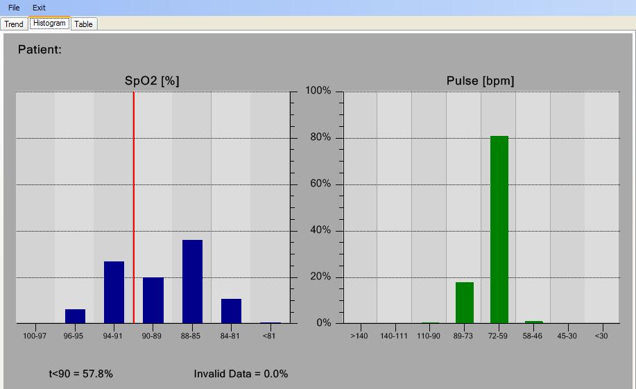
Display frequency histograms of the measured variables (SpO2 and Pulse), in side by side windows.

- The histogram use non-linear bin grouping, easily adjustable by the programmer.
- The bars used to display the frequency histogram of each measured variable use a fixed bar width. As compared to using a variable bar width, where the bar width reflects the bin limits.
- The x-axis will show the histogram bin grouping for each bar.
- The y-axis will always be scaled 0 to 100%.
- A striped background in the plotting area, the width of each bar.
- Below the SpO2 chart there will be a readout of the percent of readings less than a preset limit in the SpO2 histogram (<90 in this case). A red vertical line is displayed in the graph designating this cutoff value.
Table display of the data
A grid-like table display of the text in the source data file.
- The table will be scrollable for the entire data range (120K values).
- Our implementation includes just the sampled data, not the header information.
Miscellaneous
A few items not associated with a specific display window.
- The main form of the application will be resizeable. The tab control used to organize the displays will track the size of the main form, and the charts inside the tab control will track the size of the tab control.
- All strings used for display and formatting will be stored in a resource file, to aid in customizing the software for other markets. This includes date formatting options. The decimal separator used in the software (. or ,) automatically take into account the region the software is running in.
- Printing
- Save to Image File
|
